
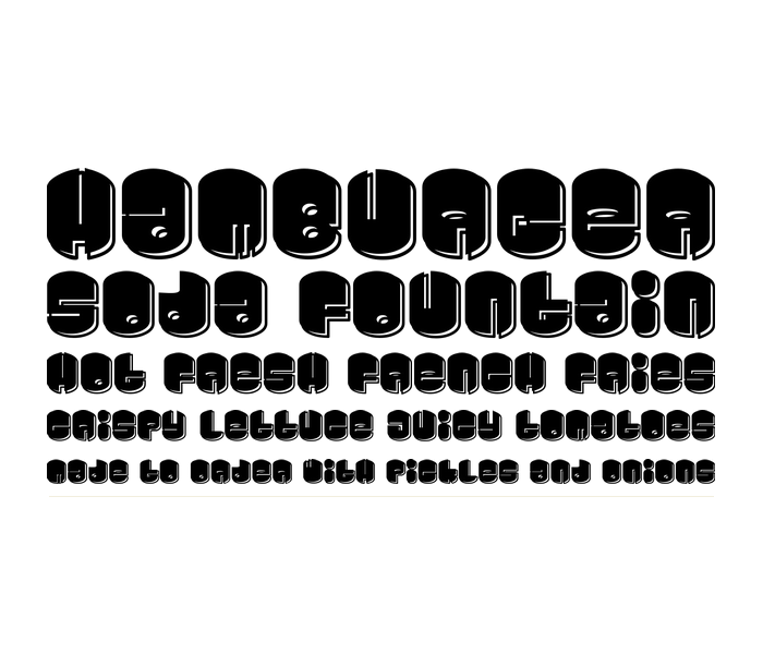
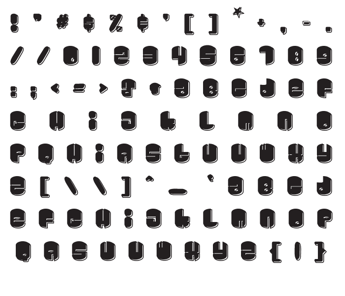
As promised, here is my remix of the font, Galaxy. Personally, I thinks it is a little harder to read than the original, but what do you expect when you remove the stars, add new circles, change the weight by 30 em units, copy, expand stroke at a normal pen width stroke of 25 em units with the round endcaps, then move it down and over 3 arrow clicks and paste the original over it, then remove the overlap?! Yeah, that’s what I thought…hey at least its free, right?